The Yield Curve and its Components
Principal Component Analysis (PCA) is a well-known statistical technique from multivariate analysis used in managing and explaining interest rate risk. This post describes how to find the level, slope and curvature of the yield curve using PCA. As a starting point, let’slook at the swap curve and describe qualitatively how it changes over time.
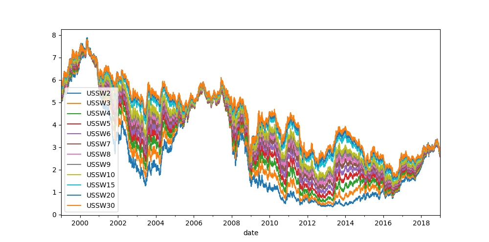
Looking at the curve path on the graph above, we can conclude that
- Prices of swaps are generally moving together,
- Longer dated swap prices are moving in almost complete unison,
- Shorter dated swap price movements are slightly subdued compared to longer dated swap prices,
- Paths are not crossing, so the curve is upward sloping in our period of observation.
The following box-and-whiskers plot of the same data gives a flavor of both rate level and dispersion during the period of observation.
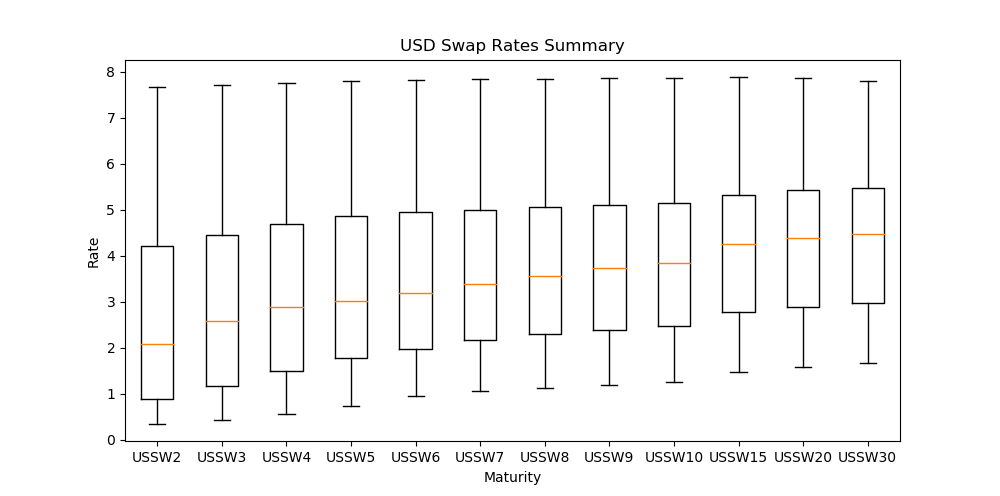
In a box-and-whiskers plot, the centre line in the box is the median, the edges of the box are the lower and upper quartiles (25th and 75th percentile), whilst the whiskers represent the last data point within a distance of 1.5 x (upper – lower quartile) from the lower and upper quartiles.
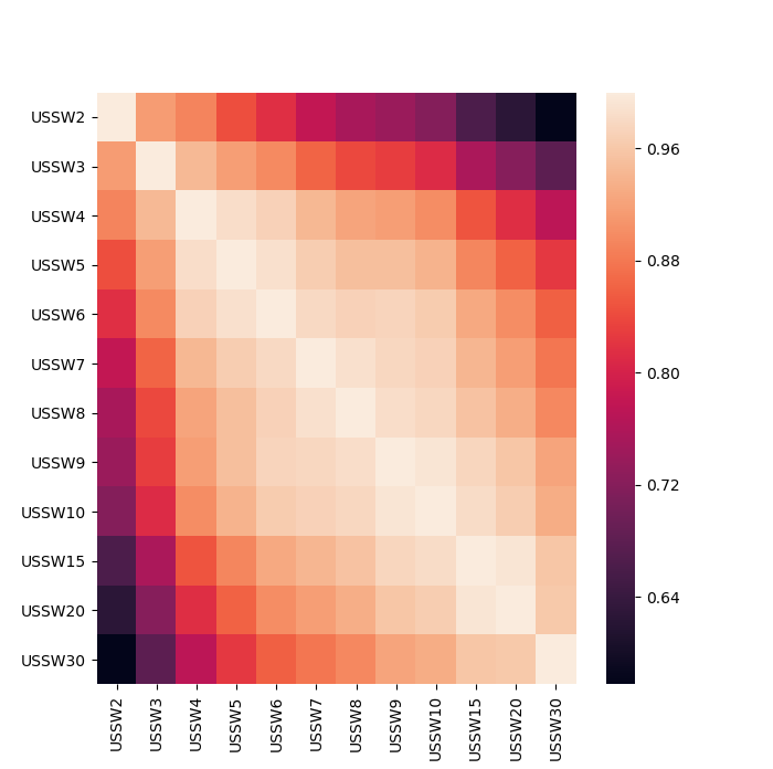
In addition, we can observe that the correlation decreases according to the difference in maturity
PCA Decomposition
The central idea of the principal component analysis (PCA) is to reduce the dimensionality of a data set consisting of a large number of interrelated variables, while retaining as much of the variation present in the data set as possible. PCA is often used to explain the drivers of interests rates and the potential risk inherent from these.
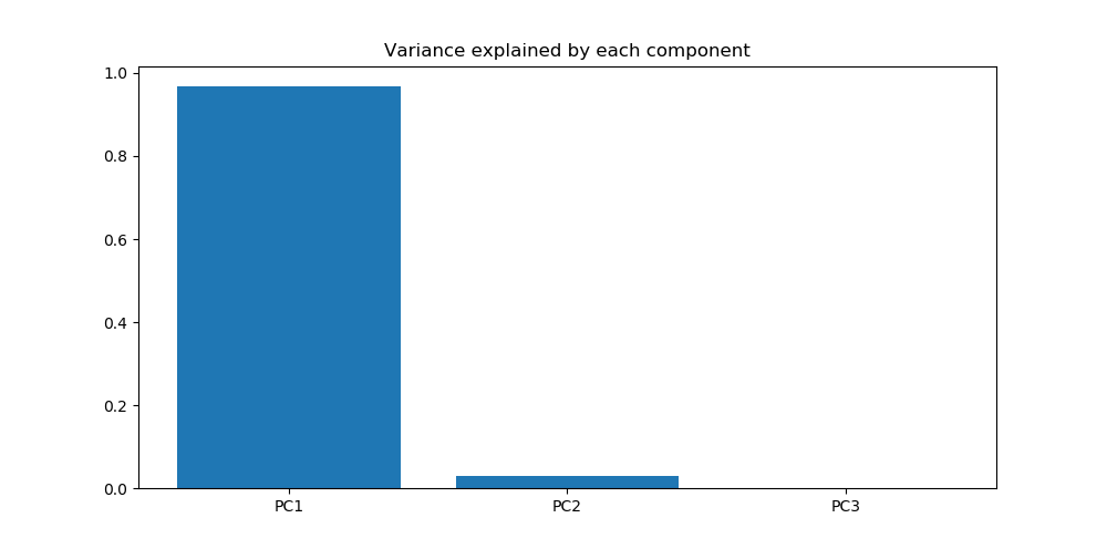
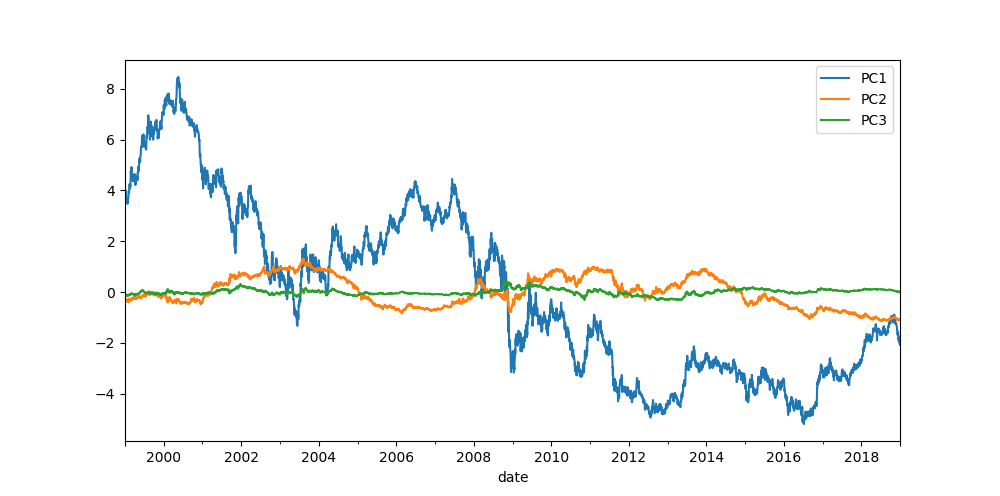
The first 3 principal components account for almost all of the variance in our data, so we should be able to use just these three components to reconstruct the initial dataset while retaining most of its characteristics.
One of the PCA advantages that can be used in the interest rates analysis is its ability to split the yield curve into a set of components. We can effectively attribute the first three principal components to:
- Parallel shifts in yield curve (shifts across the entire yield curve)
- Changes in short/long rates (i.e. steepening/flattening of the curve)
- Changes in curvature of the model (twists)
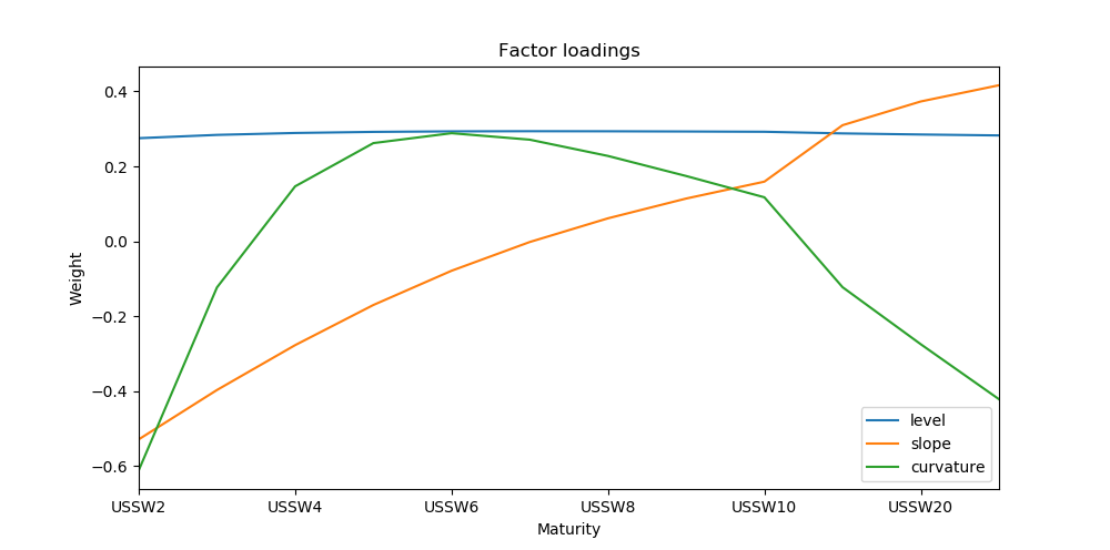
To get an idea of the terms , and , it is useful to look at the changes in the sign of the principal component loadings in the graph above.
- PC1 has the same sign for each maturity, so all rates will move up or down together due to the first principal component (level).
- PC2 has one change in sign, so the shorter maturity rates will move in opposite direction to the longer rates due to the second principal component (slope).
- PC3 has two changes in sign. Here, the shortest and longest maturities move in the same direction, whilst the middle maturities move in the opposite direction (curvature).
Practical Applications
Principal component analysis is especially usefull in the following areas:
- Explaining PnL – returns on rates products can be explained using level, slope, curvature and the residual.
- Hedging – appropiate portfolio hedging can be determined by neutralizing the movements in the first few principal components.
- Relative Value Analysis – the richness/cheapness of the curve can be analyzed using the residuals of the PCA.
- Scenario Analysis – scenario generation using the three components to evaluate market risk.
Code
Quantitative inspection
### we start by collecting SWAP rates from Bloomberg using the API to the terminal
# SWAP contracts
swap_instr = ["USSW2 BGN Curncy","USSW3 BGN Curncy","USSW4 BGN Curncy",
              "USSW5 BGN Curncy","USSW6 BGN Curncy","USSW7 BGN Curncy",
              "USSW8 BGN Curncy","USSW9 BGN Curncy","USSW10 BGN Curncy",
              "USSW15 BGN Curncy","USSW20 BGN Curncy","USSW30 BGN Curncy"]
# start and end date
date_start = "20180101"
date_end = "20190101"

# initiate connection to bloomberg and get the data
con = pdblp.BCon(debug=False, port=8194, timeout=5000000)
con.start()
swap_rates = con.bdh(swap_instr, ["PX_LAST",], date_start, date_end)
swap_rates.columns = swap_rates.columns.droplevel(1)
swap_rates = swap_rates[swap_instr]
swap_rates.columns = [i[:-11] for i in swap_rates.columns]
swap_rates = swap_rates.dropna(axis=0) # remove rows with NA

# plot SWAP rates
swap_rates.plot(figsize=(10,5))

# plot USD SWAP Rates Summary
plt.figure(figsize=(10,5))
plt.boxplot(swap_rates[swap_rates.columns].T,labels=swap_rates.columns)
plt.xlabel("Maturity")
plt.ylabel("Rate")
plt.title("USD Swap Rates Summary")

# calculate price change to observe stationarity
returns = swap_rates.pct_change()

# heat plot of correlation
plt.figure(figsize=(7,7))
corr_rates = returns[swap_rates.columns].corr()
sns.heatmap(corr_rates)
Principle Component Analysis
#####################################################
### PCA Decomposition
#####################################################

# the first three components describe the level, slope and curvature

#Get the standardised data
standardized_data = StandardScaler().fit_transform(swap_rates)

N_com = 3                       # number of components
pca = PCA(n_components=N_com)   # PCA
swap_rates_pca = pca.fit_transform(standardized_data)
PCA_df = pd.DataFrame(data = swap_rates_pca, columns = ["PC"+str(i) for i in range(1,N_com+1) ] ,index=swap_rates.index)

# plot the principle component over time
PCA_df.plot(figsize=(10,5))

# amount of variance explained by each component
plt.figure(figsize=(10,5))
plt.bar(range(1,N_com+1), pca.explained_variance_ratio_,align="center" )
plt.xticks(range(1,N_com+1),["PC"+str(i) for i in range(1,N_com+1) ])
plt.title("Variance explained by each component")

# first and second principle component plottet against each other
plt.figure(figsize=(7,7))
plt.scatter(x = PCA_df["PC1"],y=PCA_df["PC2"])
plt.xlabel("Principle component 1")
plt.ylabel("Principle component 2")

# factor loadings
factor_load = pd.DataFrame( pca.components_.T, index=swap_rates.columns,columns = ["level", "slope", "curvature"])

# plot level, slope and curvature
factor_load.plot(title="Factor loadings",figsize=(10,5))
plt.ylabel("Weight")
plt.xlabel("Maturity")